A name, and a dot that is alive.
Everything here is free to use when you write about lookunique. Please use it as it is.
The logo
The logo is the name, lowercase and in one word, drawn in Fraunces: bold, soft and upright. The dot on its i is not a dot. It is made the way every shirt in the shop is drawn, out of separate ink dots, and on a screen those dots are alive: they grow in, hold, drift, make room for each other and fade. In print and on cloth it is a still of the same dots.
The round mark is that dot on its own, in a perfect circle. It is the shop's icon: the browser tab, the app, the label in the neck. The name and the mark are never set side by side as one sign; use one or the other.
Where the dots come from
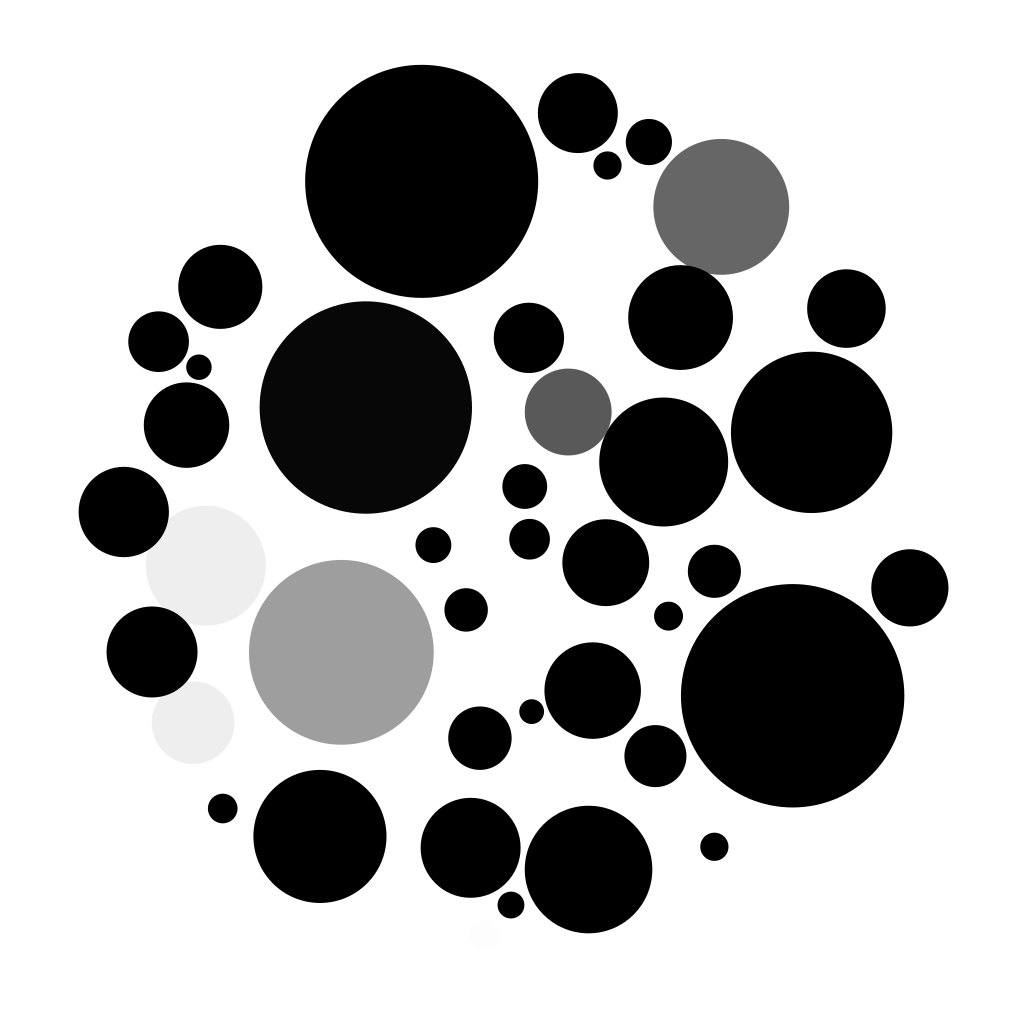
Every drawing starts as a grey sketch from our own AI farm. Then our code covers it in ink dots, and this is the part we are proud of.
It scatters a few thousand points over the sketch, most of them where it is dark. Around each point it draws its cell: the patch of paper closer to that point than to any other, which is called a Voronoi diagram. Then every point moves to the middle of its cell, weighed by how dark the sketch is there. Twenty-four rounds later the points have settled: close together in the shadows, far apart in the light, and lined up along the edges so the outline reads. Each point becomes a round dot as big as the darkness under it. The method is weighted Voronoi stippling, after Adrian Secord's paper of 2002; engravers did it by hand for centuries.
The file a shirt is printed from is that drawing, dot for dot, at print size. On a dark shirt the dots are bone and the cloth is the ink.
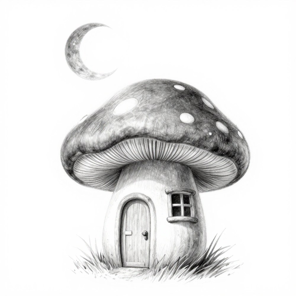
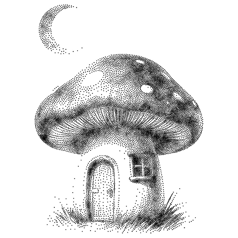
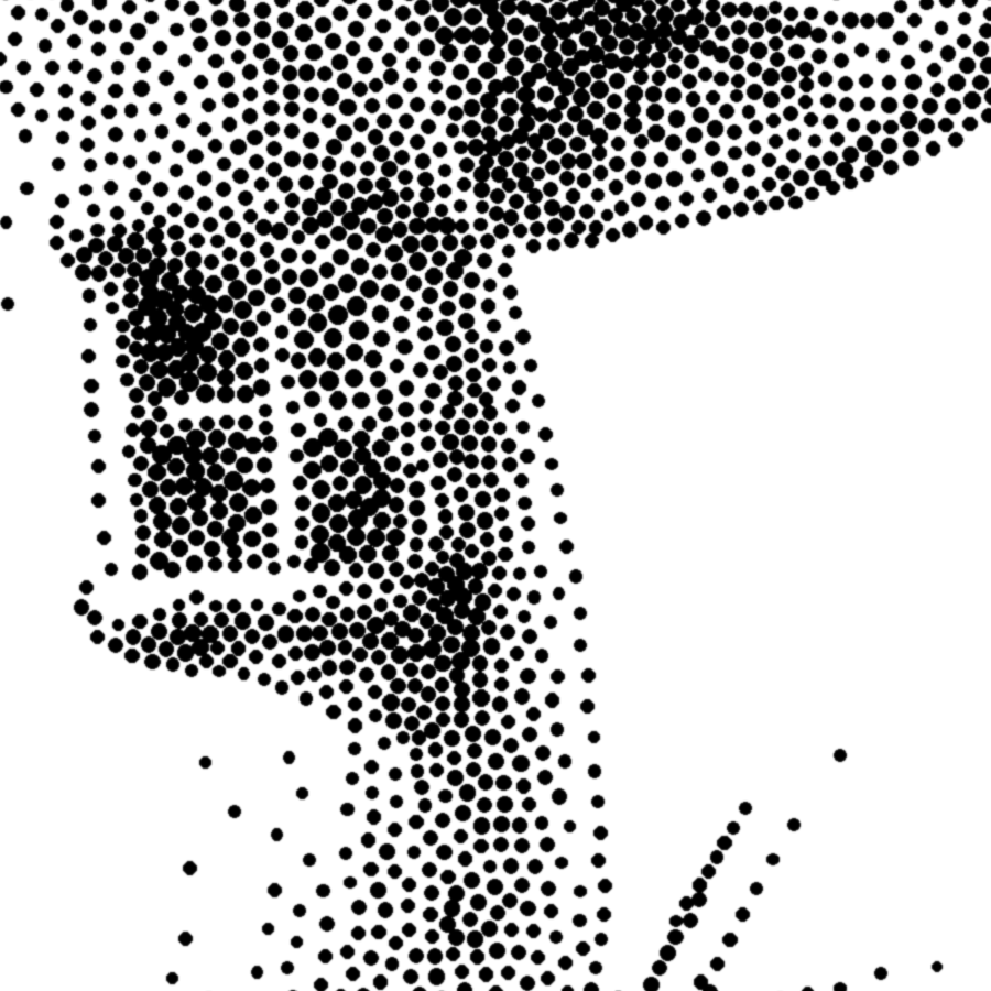
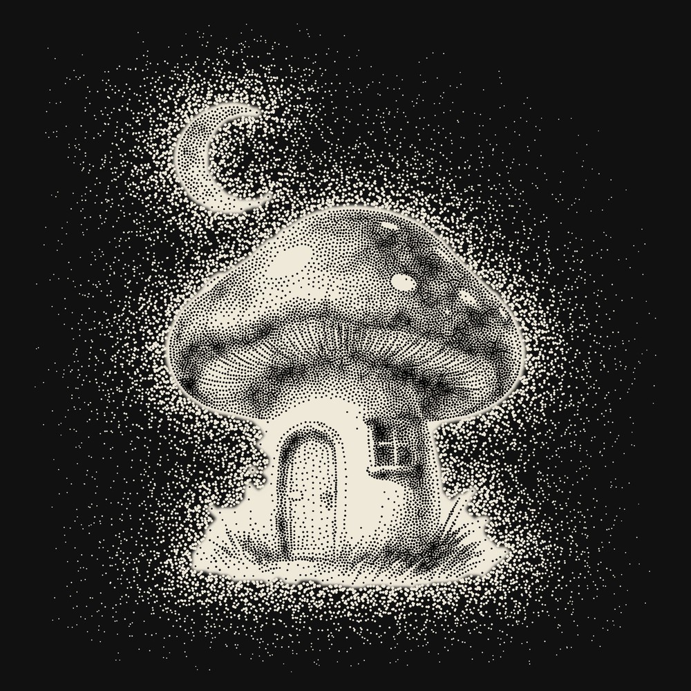
“A mushroom village at night under a crescent moon”, drawn by the shop.
Using it
- Write the name lowercase and as one word, also at the start of a sentence: lookunique. Not LookUnique, Look Unique or LOOKUNIQUE.
- The logo is drawn, not typed. Use the files below; please do not set the name in Fraunces or any other font as a logo.
- Black on light, bone on dark. No other colours, no outlines, shadows or gradients.
- Give it room: on every side, at least the height of its o.
- Not smaller than 80 px or 25 mm wide for the logo, 16 px or 6 mm for the round mark.
- Do not stretch, slant or rotate it, and do not put a plain dot on the i.
Colours
- Ink
#000000The logo, the drawings, the words. - Bone
#efe9daThe logo and the dots on a dark shirt. - Paper
#f5f5f0The page everything sits on. - Blue
#2742f5Only the button that buys. Never the logo.
Type
Fraunces for the logo, and in italic for whatever people type into the shop. Inter for everything else. Both are free fonts from Google.
Files

The logo
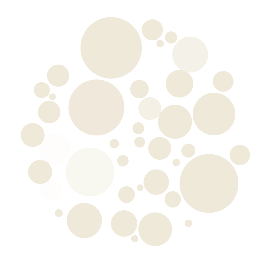
The PNGs are 2400 px wide, on a see-through background.



The round mark
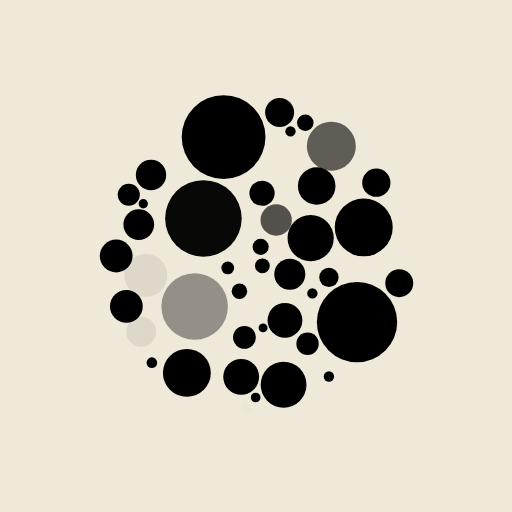
The PNGs are 1024 px; the app icon is 512 px on bone.
For the press
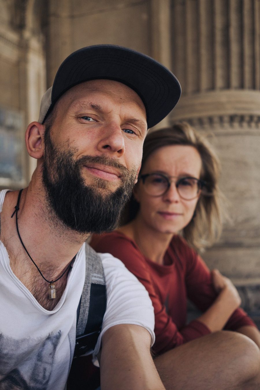
lookunique is a small t-shirt shop from Tallinn, Estonia, run by Priit and Karolin Pärna. You type a line or send a photo, our own AI farm draws it in separated ink dots, you choose the picture, and the shirt is printed to your order in Germany and posted free within the EU. A drawing stays in the shop after it sells, so a friend can order the same shirt.
Priit worked on Skype when it was still a handful of people in Tallinn, and built the shop and set up the AI farm that draws for it. Karolin taught French and answers everyone who writes, in five languages.
If you write about how the drawings are made, this is how we say it: they are drawn on our own AI farm, which runs on solar power with a battery behind it, and every dot is placed by our own code.
For an interview, more pictures or anything else, write to [email protected]; one of us answers. Surfzone OÜ, Tallinn, Estonia. More about us on the About page.